DURATION
2 weeks // 2020 UXAcademy, DesignLab.
MY ROLE
UX Research, Information Architecture, Design, Prototyping & User Testing.
SUMMARY
The goal was to create a conceptual feature for Spotify by designing within established constraints to improve an existing product. (This project is not affiliated with Spotify)
Introducing Spotify Video! Premium visual and audio content for all music lovers.
Background
Spotify is a Swedish company that streams music, videos, and podcasts through licensing agreements and record labels. Spotify is an innovative company that uses data-driven insights to provide users with exclusive content as well as tailored playlist suggestions like Discover Weekly, Fresh Finds, and Release Radar.
The Challenge
Spotify’s key competitors are Apple Music, Tik Tok, and Tidal, all of which are innovating in order to stay relevant. Spotify is still growing and has over 100 million active listeners and over 40 million active paying subscribers.
However, in order to stay ahead of the game and retain their market share they must roll out new features to improve app engagement.
1. Empathize
Research Methods
I completed 3 different research methods to gain a deeper understanding of the market, key competitors, and core user needs.
Market research;
Competitor analysis; and
User surveys.
Market Research
The company has re-focused the brand in recent years. With a new sophisticated design system that helps captivate its audience around a particular mood or moment rather than genre-specific playlists. Spotify has also put more emphasis on artists in recent years. New initiatives like Rise help artists break into the mainstream by integrating them into popular playlists.
Goals:
To integrate social features
Create more social and meaningful moments around the user’s music listening habits;
Such as karaoke feature, live concert feature, Spotify Pumped (guided workouts — already live)
Tap into the user’s everyday lives where music and audio entertainment can play a bigger role
Needs & Demographic info
The majority of Spotify’s users are millennials (72%). Gen Y & Z are the second largest demographic (below the ages of 18)
No significant distinctions between male (55%) & female users (45%)
Users want an app that provides all types of auditory entertainment
Personalized playlist suggestions, artist recommendations and genre discovery based on the app’s algorithm
Organization of personal playlists and music
Genres to fit different moods and appeal to every occasion
Browse for new podcasts and music seamlessly
View music videos without having to leave the app (Audio Visuals)
Make music sharing more collaborative and social
Competitor Analysis
Competitor Analysis
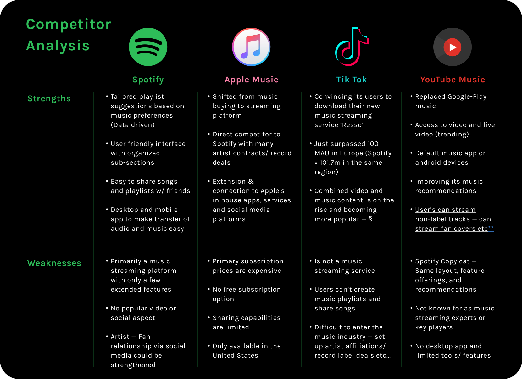
Let’s try and understand the market a bit more. As a result of secondary research, I established 3 different competitors in the music and video entertainment industry and listed their strengths and weaknesses.
Key Findings:
Companies like YouTube Music, Tidal, and Pandora have tried to emulate features seen in Spotify;
Spotify’s algorithm that suggests new songs, artists and genres, is one of the most valuable features to their users;
The rise of Tik Tok has led to a number of new trends that existing companies must respond to.
User Surveys
User surveys and interviews are valuable research tools that enable us to understand the different behavior and usage patterns of millennials during their Spotify use. The answers will be insightful in considering what features should be added based on user demand and needs.
I used a mix of short answer and multiple-choice questions for the user survey. I thought this was a good way to gather quantitative data for my research.
After receiving a few initial responses, I had to go back and adjust the questions, add follow up questions and give more explicit instructions on the detail and length of answers eg... “answer in as much detail” and “there are no wrong or right answers.”
The answers that followed this adjustment were more insightful and I gathered a stronger sense of what users were looking for.
2. Define
Persona & Empathy Map
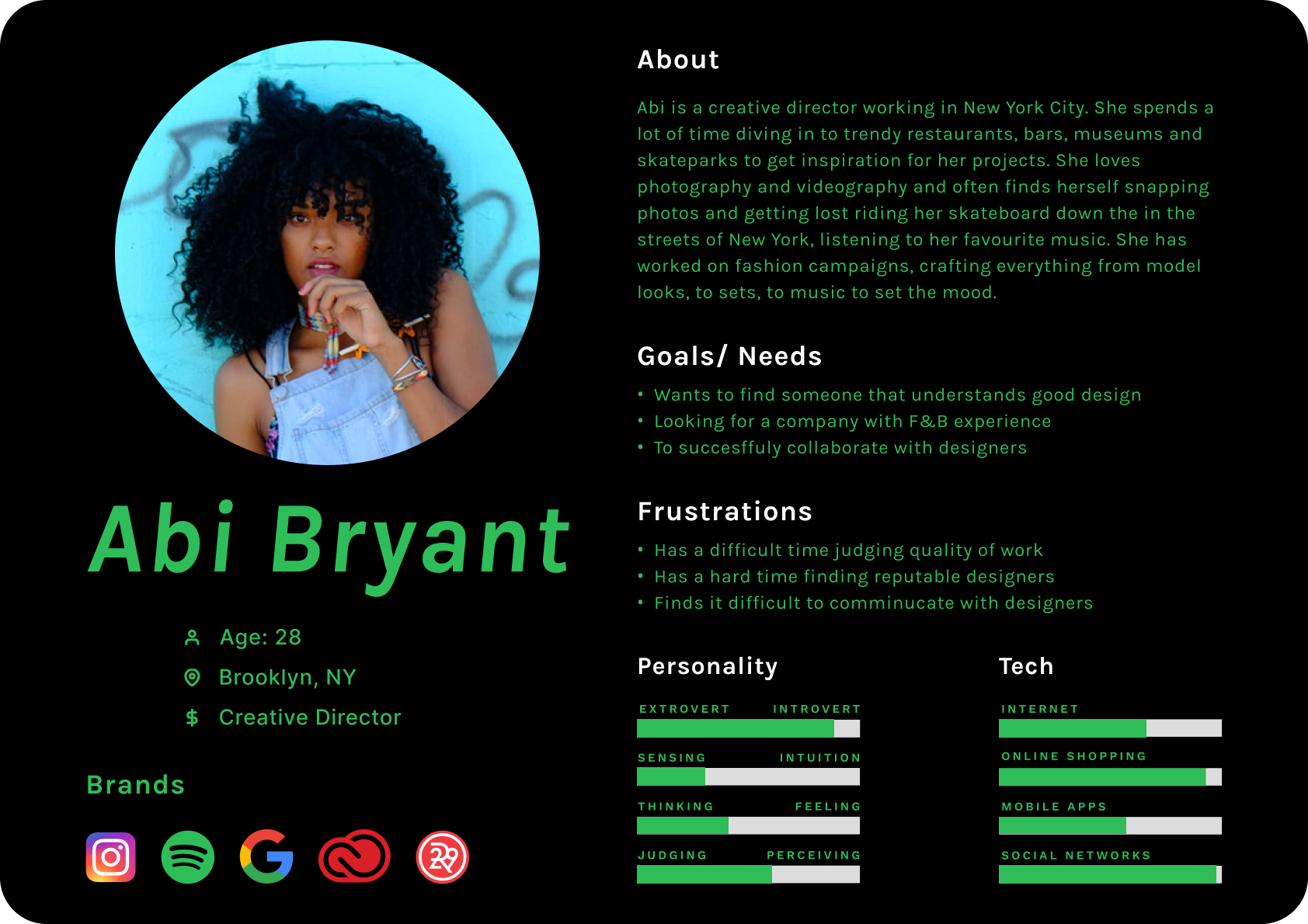
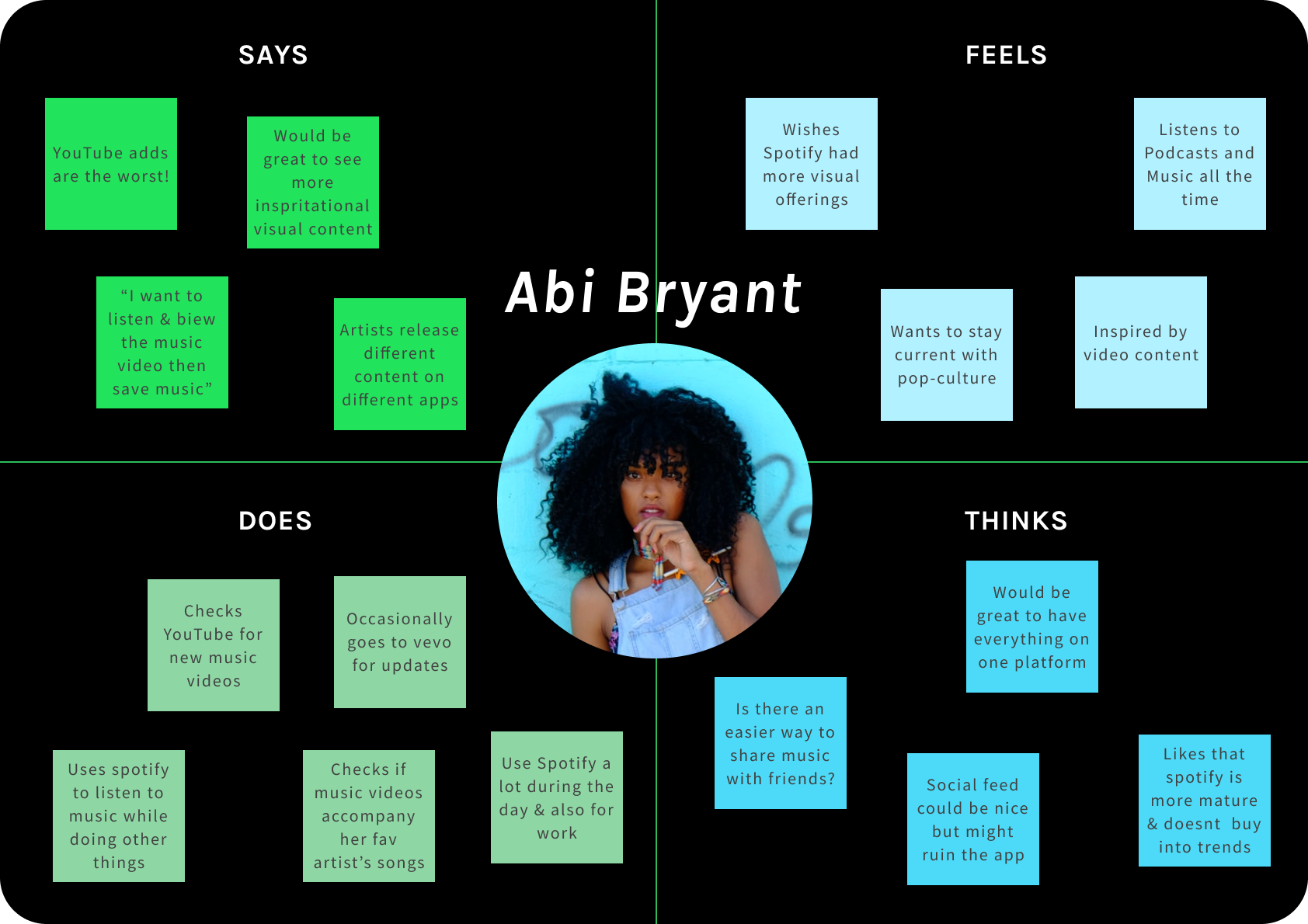
Meet Abi! Her persona was developed to highlight key character traits to keep in mind when developing a new feature for Spotify.
Creating an empathy map based on her user attributes helps us empathize with her needs, goals, motivations and pain points.
Persona
Empathy Map
POV Statement:
In order to stay relevant, and to keep up with growing trends on social media, Spotify must innovate and find new ways of extending its audio entertainment offerings to retain app engagement amongst its users.
How Might We Statements:
How Might We…
Integrate a new feature that gives users visual content?
How Might We…
Help users find video content on Spotify?
How Might We…
Tailor music video releases to suit user’s preferences?
Information Architecture
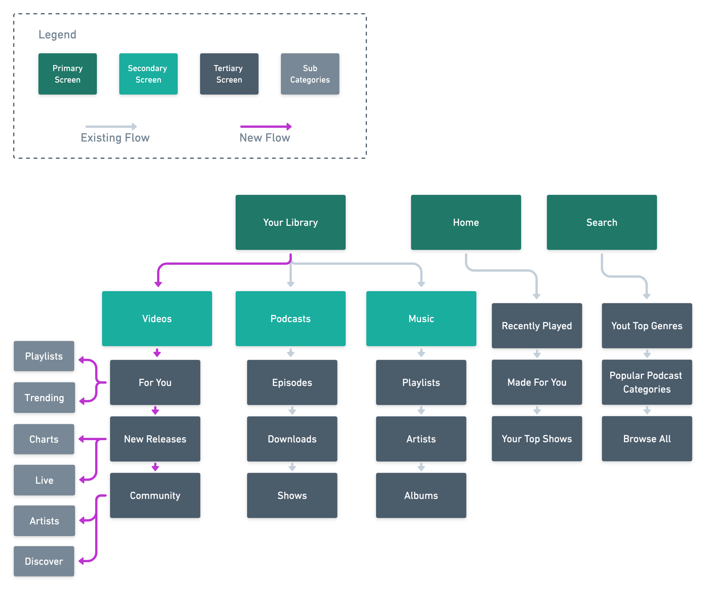
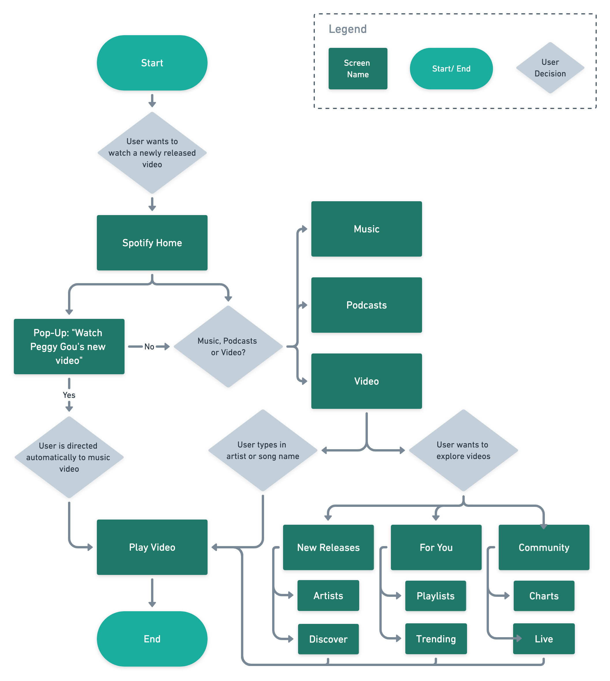
Flowcharts and sitemaps help us to visualize the structure, layout, and organization of product features, especially when adding a feature to an existing and established product.
The Sitemap and Task Flow seen below, demonstrate how I plan to integrate the Video feature. Spotify already has 2 different audio content categories: Music and Podcasts. I thought that by introducing a third category in this existing section, I would reduce the number of pages and new learning for users.
Site Map
Task Flow
3. Ideate
Wireframing Our Ideas
I started by creating some Lo-Fi wireframes to get a sense of Spotify’s existing layout, scale, and style. Then integrated my ideas with Spotify’s design goals in mind.
Low Fidelity Wireframes
4. Prototype
Hi-Fi Wireframes
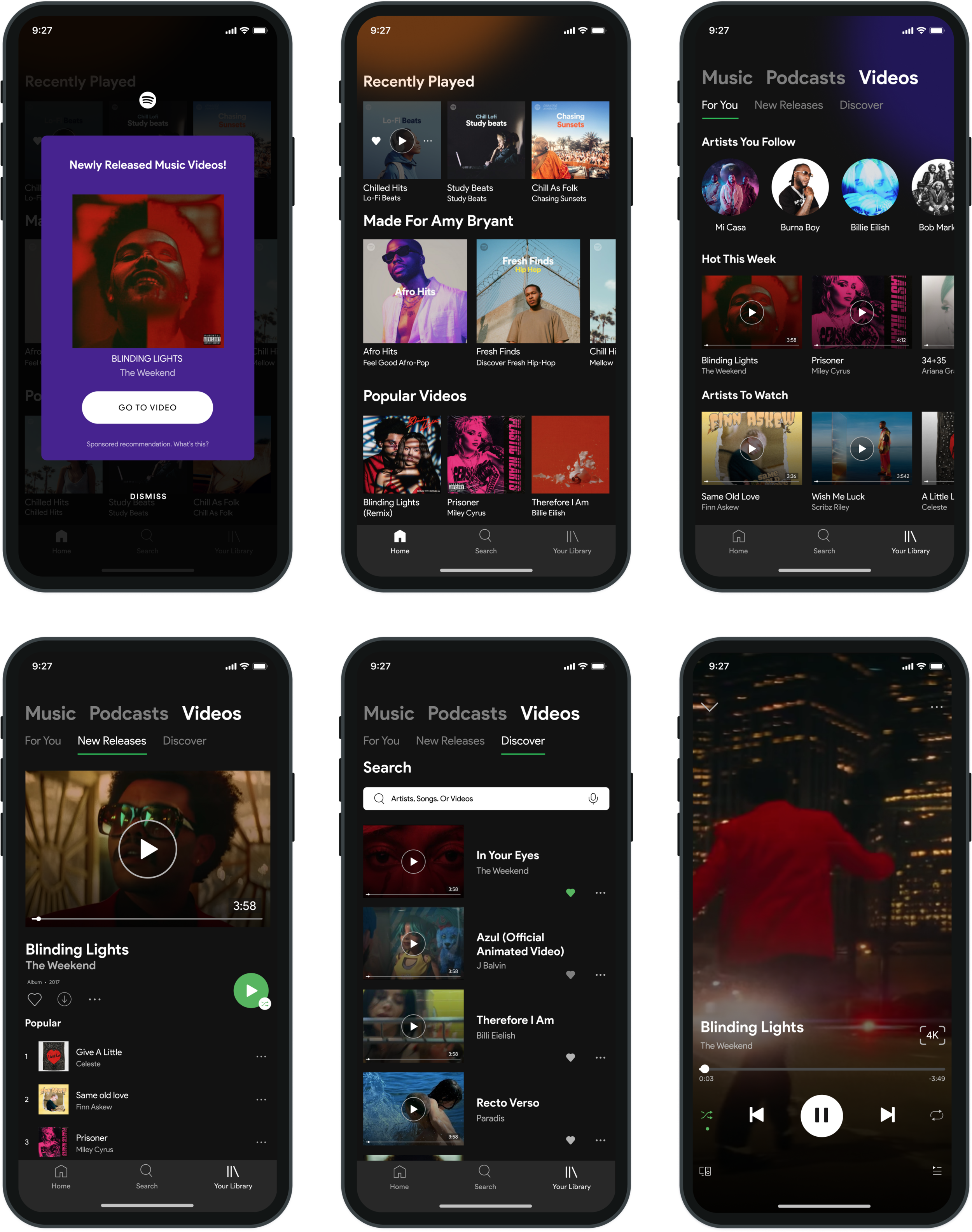
The clickable prototype was developed High Fidelity wireframes to focus on the flow of a user opening the app to watch a new video release from one of their favorite artists. I really enjoyed putting together these screens and understanding how Spotify is designed and conceptualized.
I included some opportunities for the Spotify algorithm to suggest similar videos and curated playlists as they do for music and podcasts.
Hi Fidelity Wireframes
5. Test & Iterate
Usability Testing
The prototype was tested with 5 Spotify users, to establish existing pain points I may have not noticed when designing. The feedback helped me iterate to produce a set of wireframes that would function more seamlessly in the real world.
The main design challenge I faced was distinguishing video cards from audio ones. Spotify uses a small play button in a circle when the user hovers over the song (on the desktop app) so I thought of incorporating it with a status bar and including the video quality size at the bottom (left).
These icons are commonly used in YouTube and Vimeo and most users would understand the visual language carried over on Spotify. The image to the left shows my progression of ideas.
User Feedback:
“If I am listening to a song that has a music video, how can I watch it without going to the Video section on the app?”
“Do all the videos play in 4K or HD? I don’t want to use large amounts of data to watch the video so I’d like there to be an option to change it myself.”
“This will definitely rival YouTube, I would use this feature a lot if I could easily track my favorite artists and keep up with their new music video releases.”
“Can I download and watch the videos offline?”
Conclusion
Moving forward, I would include tooltips to help users identify new elements or features. I think this would be a more explicit and clear way of navigating the user through the feature. The tooltips would include brief, informational banners when the user opens the app for the first time after the video feature has been added.
This has been one of the more exciting projects I have worked on during the DesignLab UX Academy course. It has provided insight into existing products and the constraints one must consider when working to improve them.


