

CLIENT
Kwepa Insurance
STAKEHOLDERS
ICON Limited. www.iconsoft.co
MY ROLE
Primary UX/ UI designer
Research, Information Architecture, Branding, Prototyping, Usability Testing, UI Design.
SUMMARY
Kwepa is disrupting the insurance industry by making digital insurance solutions more accessible to buyers across East Africa.
The goal was to create an app that allows users to browse, use, and purchase tailored motor insurance policies online.
Background
General Insurance companies in Kenya and Africa as a whole are suffering. In 2018, insurance penetration in emerging EMEA markets was below 2%, where the global average is over 6%. In order to remain competitive, insurance companies must digitize their products and appeal to a younger demographic of insurance buyers in an easy, accessible, and affordable way.
Challenge
The insurance industry has remained largely unchanged for many years. Young motor insurance buyers are reluctant to purchase insurance policies through agents or brokers as the process is outdated and laboursome.
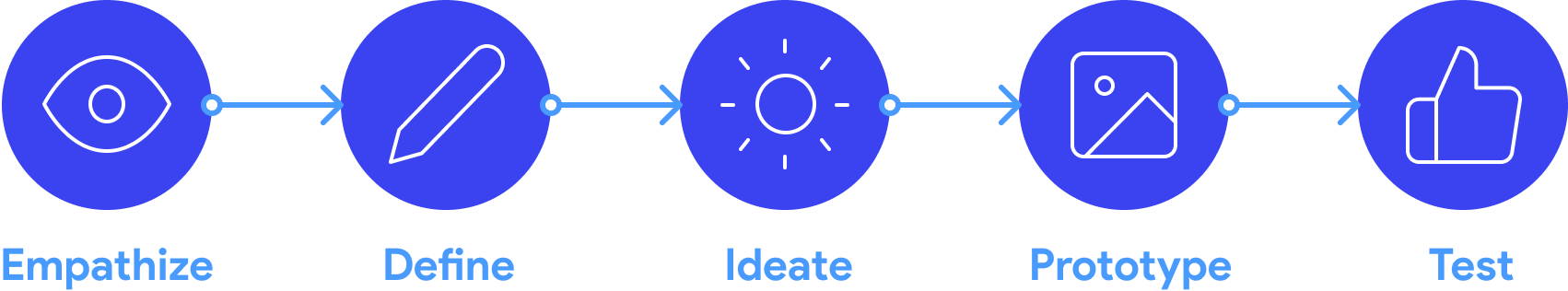
1. Empathize
Research Methods
Secondary Research - To learn about the market and key players currently influencing user decision making
Competitor Analysis - Analyze competitor strengths & weaknesses & pinpoint opportunities for growth
Surveys - Conduct surveys to develop user empathy, valuable insight, and quantitative data
Objectives
Understand how users currently purchase insurance.
Understand the users’ needs, wants, and frustrations when it comes to making insurance decisions.
Look into existing solutions and competitor frameworks and Identify user pain points and opportunities for growth
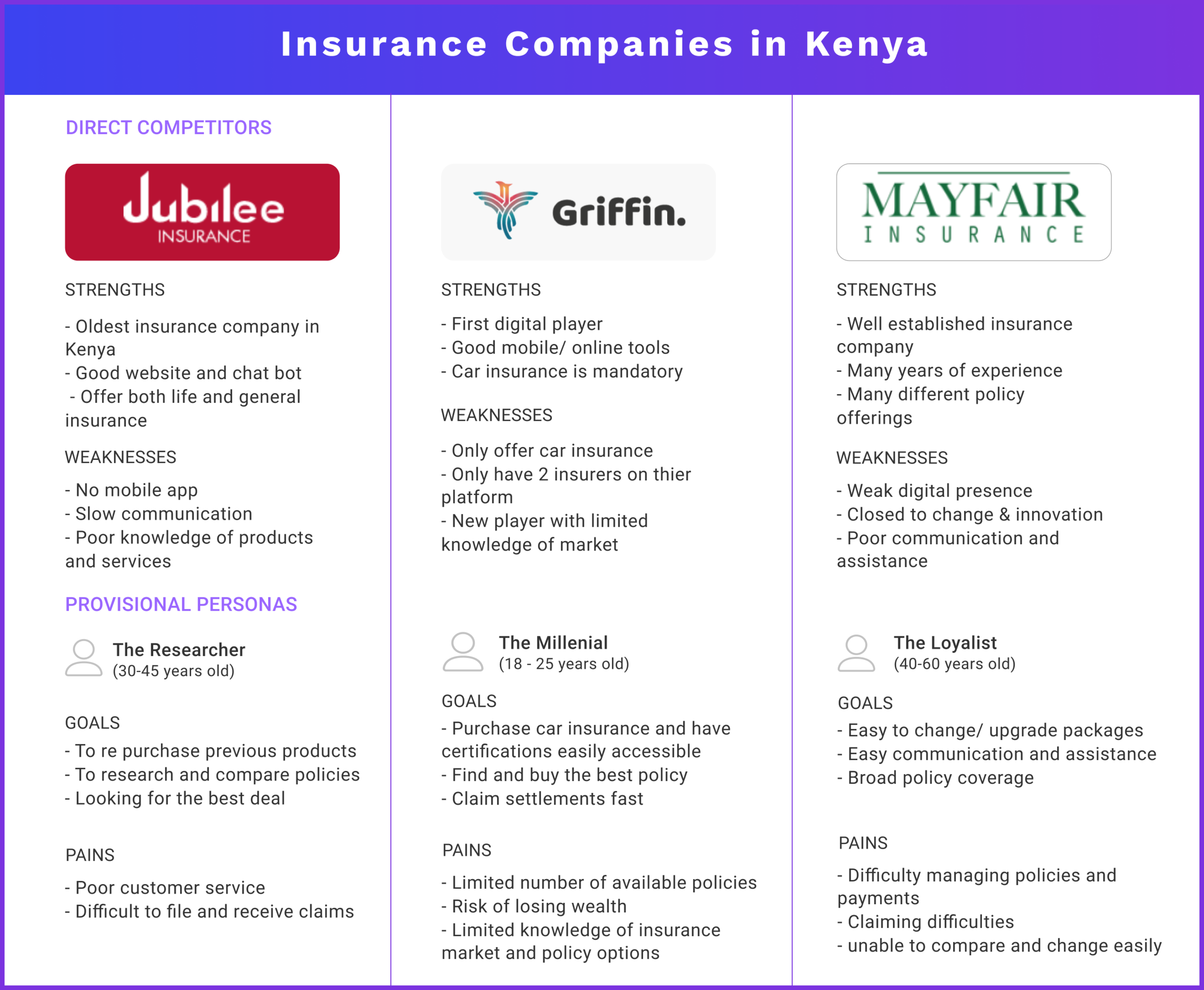
Competitor Analysis
Competitor Analysis
Most providers offer composite insurance, a combination of General and Life insurance. The products sold by different insurers are generally the same but the value-added service for consumers differs from each insurance company. It is important for buyers to seek guidance as this will ensure they are buying the best policy to meet their needs.
Industry Findings:
Low penetration rate
High insolvency rate
Poor claims payment standard
Cutthroat price competition
Inefficient data collection and maintenance (spreadsheets)
User Interviews
During the research and empathize phase I set up 1:1 interviews and survey questionnaires to gather appropriate qualitative and quantitative data of users’ knowledge and experience when purchasing insurance policies.
Summary of findings:
Price was the main concern
75% of participants had a below than satisfactory insurance buying experience
The insurance buying process was started as a laborious process
50% said they had had no difficulty filing a claim online
50% said they struggled to file a claim through an agent/ broker
User findings:
Wants:
A way to compare and modify insurance policies
An app to compare insurance quotes and get receive information about insurance brokers
A way to compare and modify insurance policies
Needs:
A modern, fluid, easy insurance buying process
A way to compare and browse policies that meet the users’ requirements.
2. Define
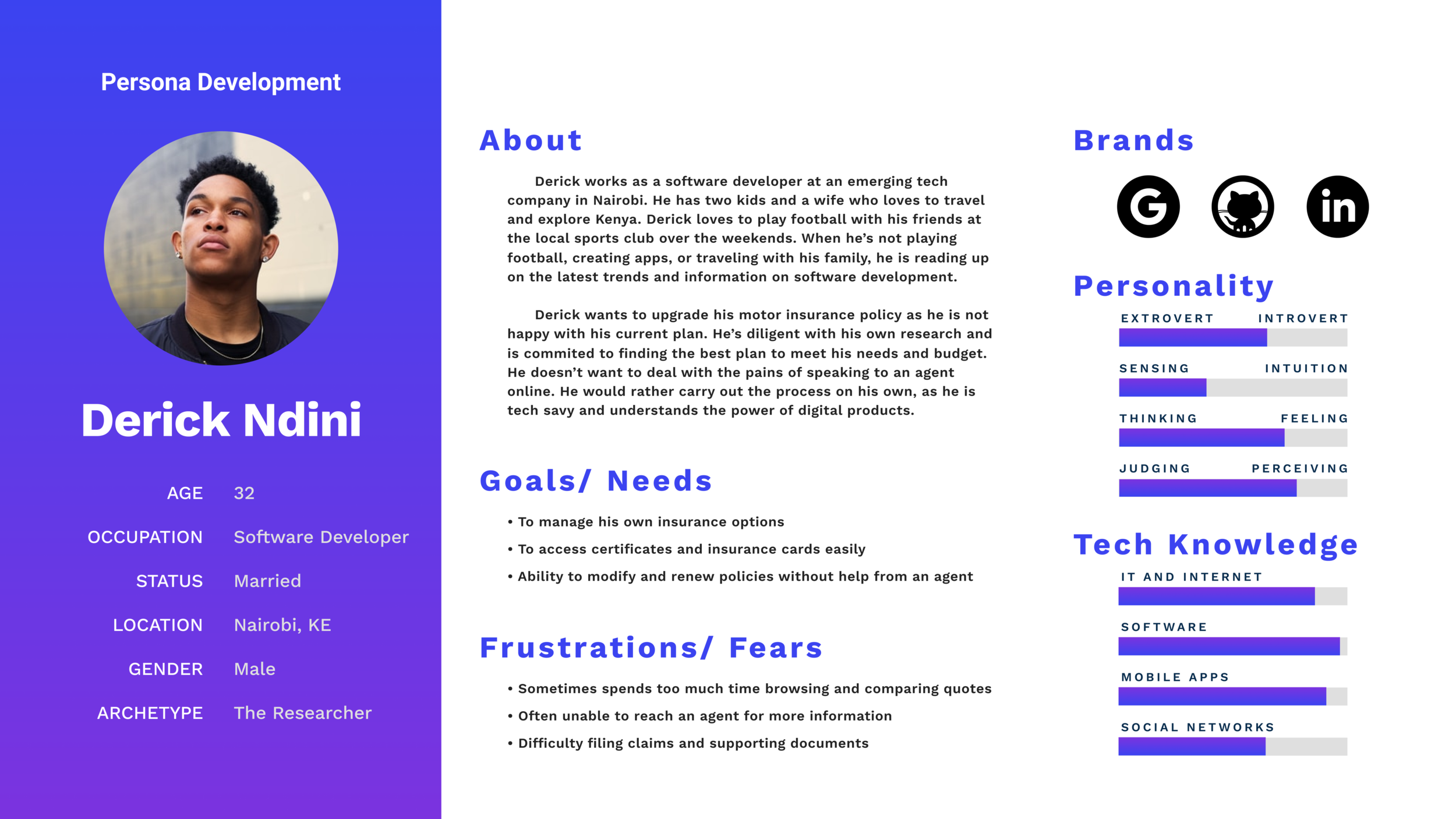
Persona Development
Provisional Persona
Meet Derick. His persona was developed using insights gathered from 1:1 interviews, primary research, and survey answers.
The persona and empathy map is useful deliverables to keep under consideration while designing, to ensure that we are ultimately designing a product to improve the lives of the end user - human beings who will ultimately be interacting with this product.
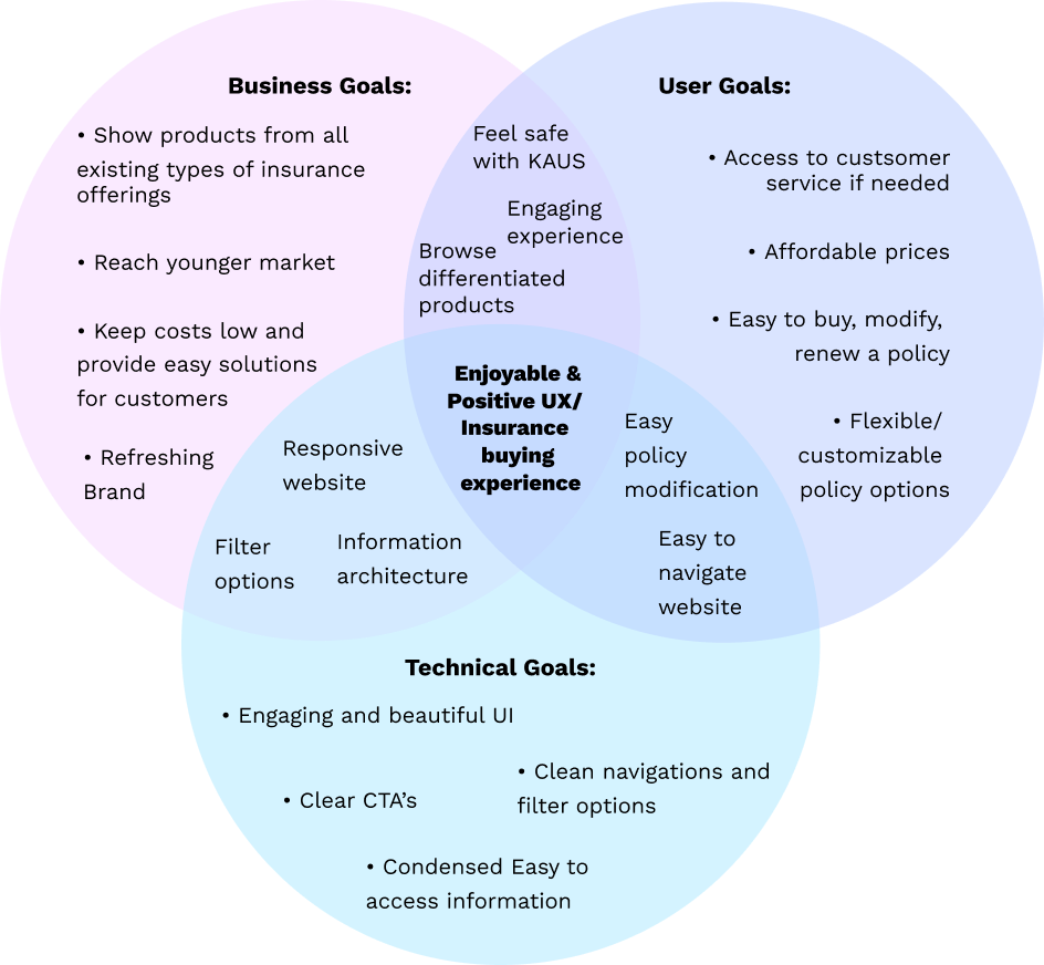
Defining Goals
After I analyzed the findings from the research stage. I went back to re-define the goals of the project. Incorporating business goals, technical goals and user goals to identify shared common goals in order to start ideating on potential solutions.
Persona Development
POV Statement:
POV Statement: A new, young demographic of motor insurance buyers need an easy, accessible, and digital method of browsing insurance policies because the current system is outdated and laboursome.
How Might We…
Provide users with security and reliability when it comes to buying motor insurance?
Create a modern and intuitive insurance platform for a younger demographic?
Synthesize insurance information and present it in a digestible way for users?
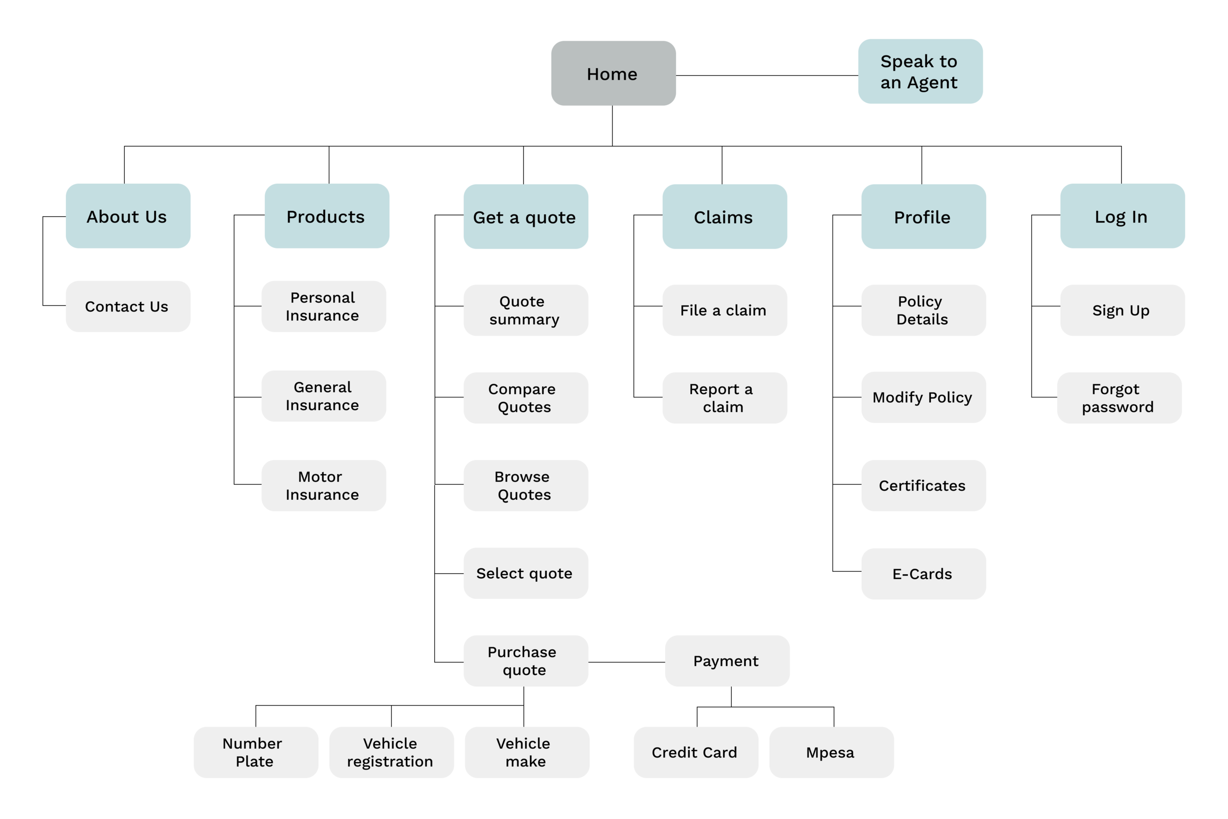
Site Map
Information Architecture
Flowcharts and sitemaps help visualize the structure, layout, and organization of different product features. Using the information from market and secondary research, I set out to create a site map to prioritize the app’s navigation and information categorization.
Flow Charts
Flows charts help us visualize information and prioritize features. The categories used in the flow charts were synthesized from the card sorting results as well as answers from the user survey. These were the most ‘intuitive’ classifications of information that participants identified with.
User Flow
User case 1 shows a new user’s actions from downloading the app, browsing different policies, inputting vehicle information, and purchasing motor insurance.
User case 2, explores a returning user. How would they modify, cancel, or create auto-renewal payments for existing policies? Is the information easy to find? These are important questions to consider before designing a solution tool.
User case 3 investigates how a crisis user would utilize the app’s services. Is the correct information easily accessible? We would have to provide adequate help and contact information in case of emergency situations.
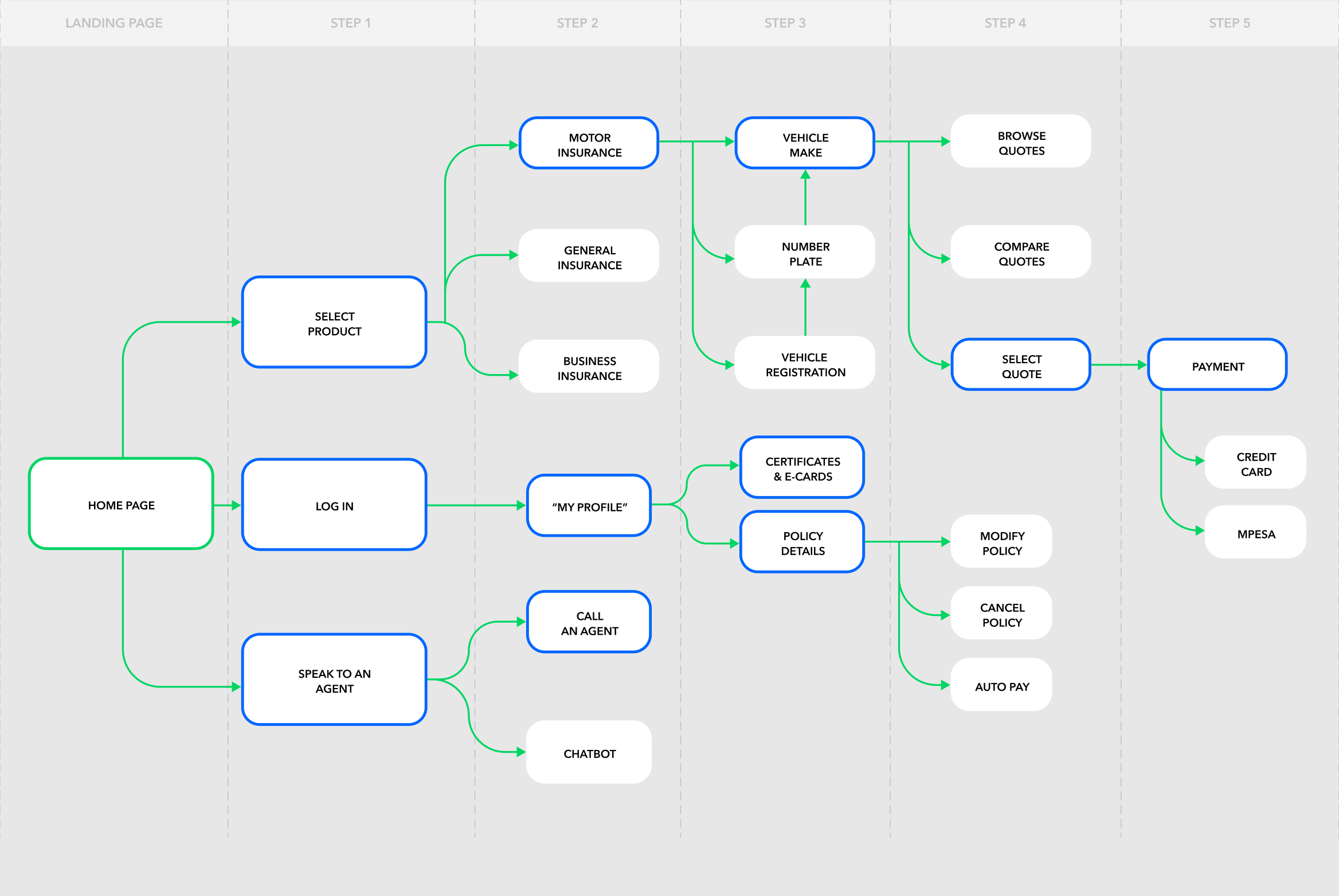
Task Flow
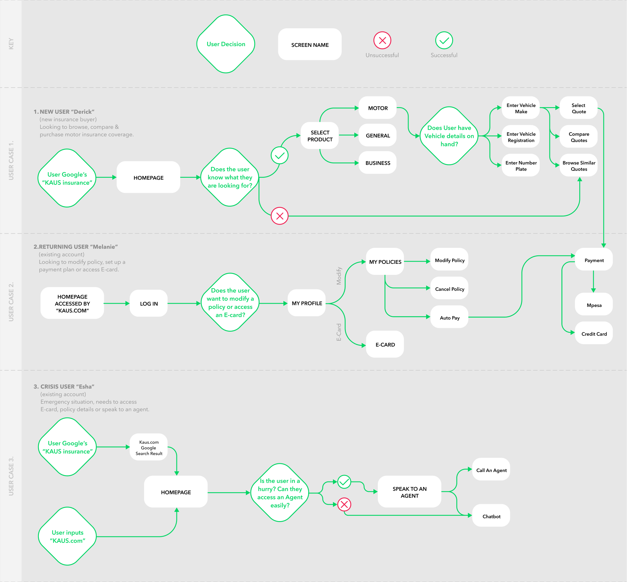
User Flow
3. Ideate
Fidelity Evolution
The third step of the design thinking process is ideation. I started by sketching out different wireframe layouts to visualize the flow and structure of the responsive web pages and the app in different ways. I then moved onto Lo-Fi mockups before developing the brand identity, creating Hi-Fi mockups, and a clickable prototype.
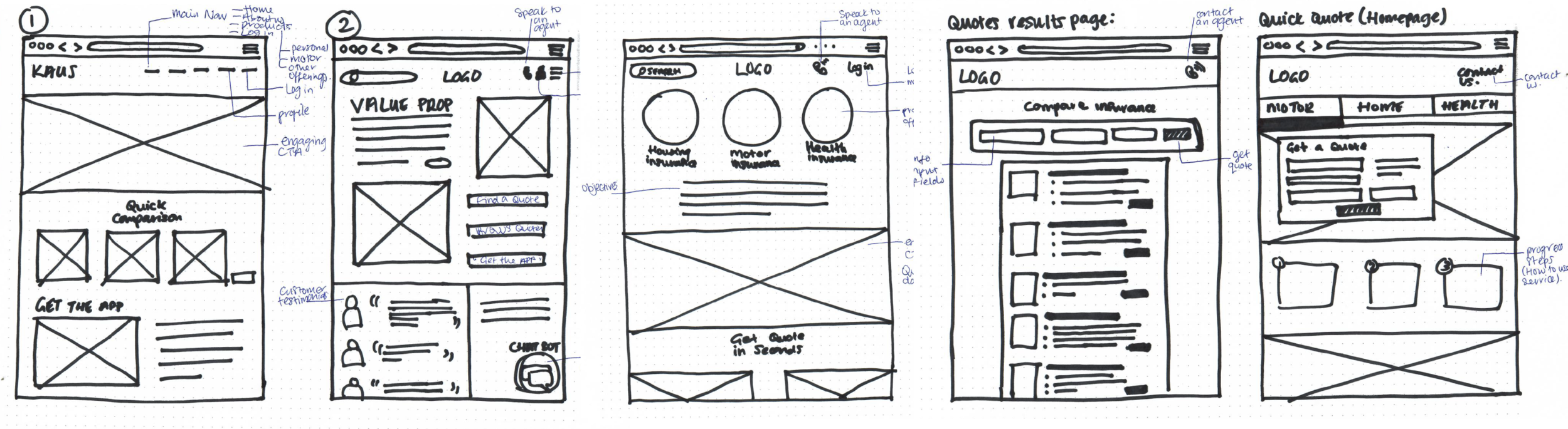
Wireframe Sketches
Lo-Fi Web Wireframes
Lo-Fi Mobile Wireframes
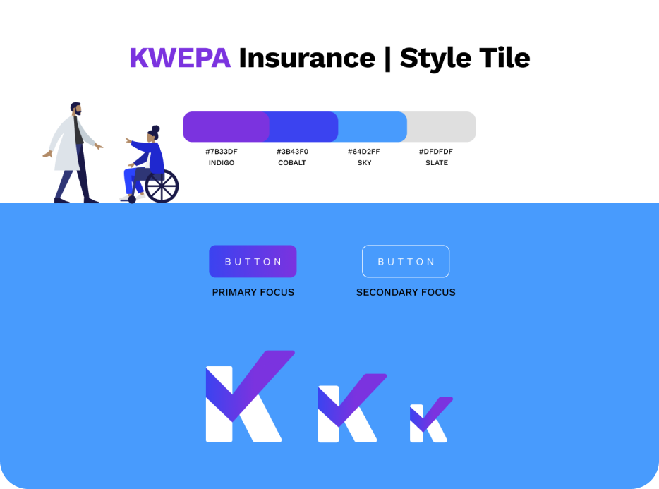
Style Tile
Branding and UI Kit
An insurance app should convey messages of confidence, reliability, and professionalism. With these key adjectives in mind, I started to develop a style tile and logo.
Blue is often associated with insurance companies as it creates the perception of security and stability. After sketching out a few initial ideas for the logo, I decided to develop the concept that included the tick because of its nod to insurance.
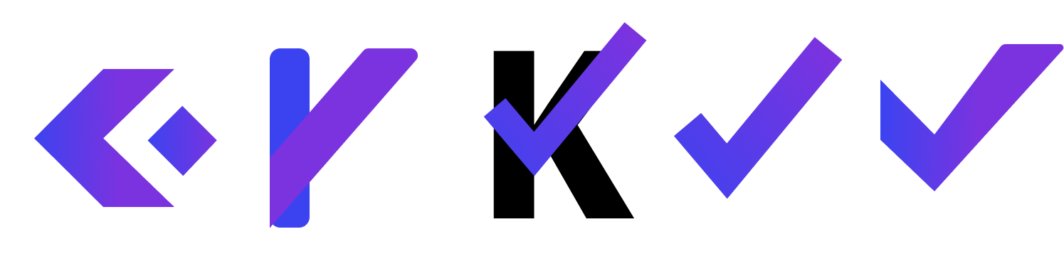
Logo evolution
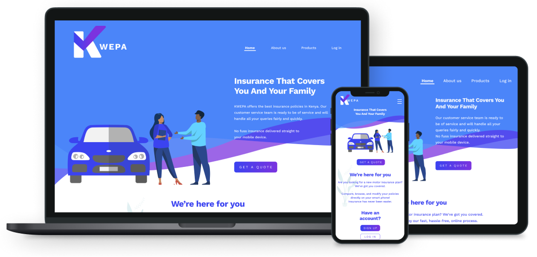
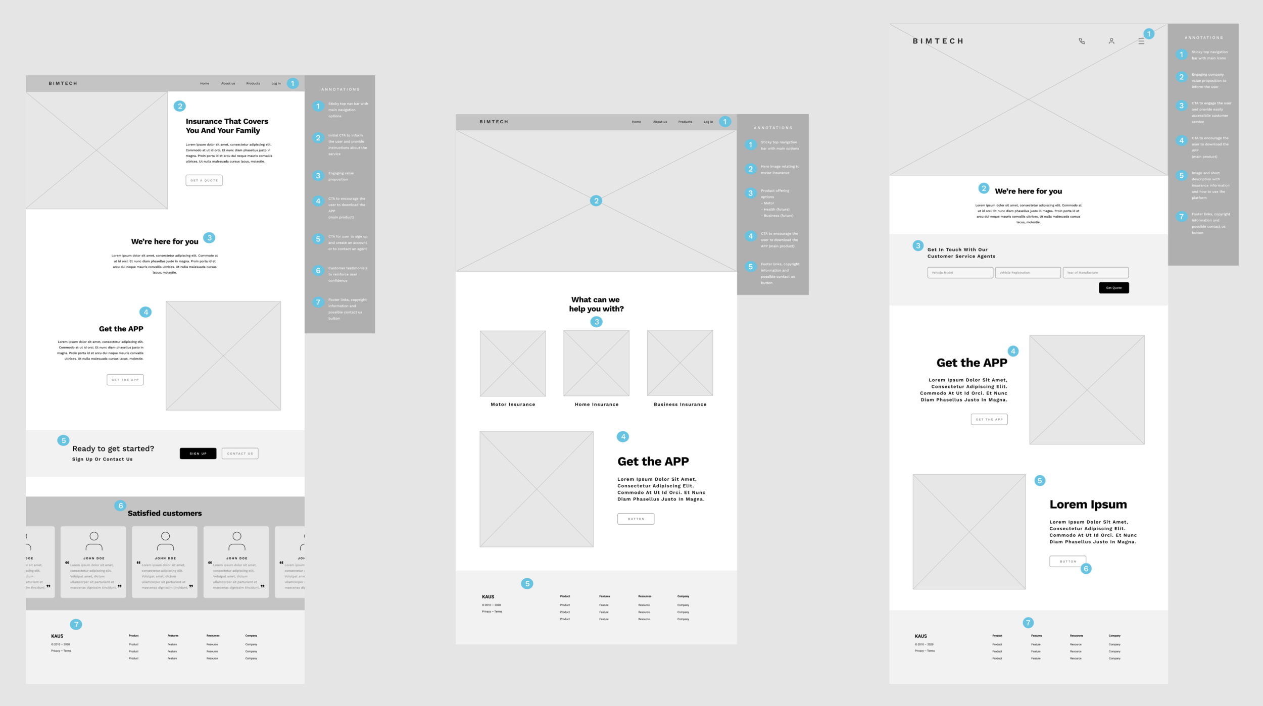
Responsive Web Design Homepages.
Responsive Web Design
Blue is often associated with insurance companies as it creates the perception of security and stability. After sketching out a few initial ideas for the logo, I decided to develop the concept that included the tick because of its nod to insurance.
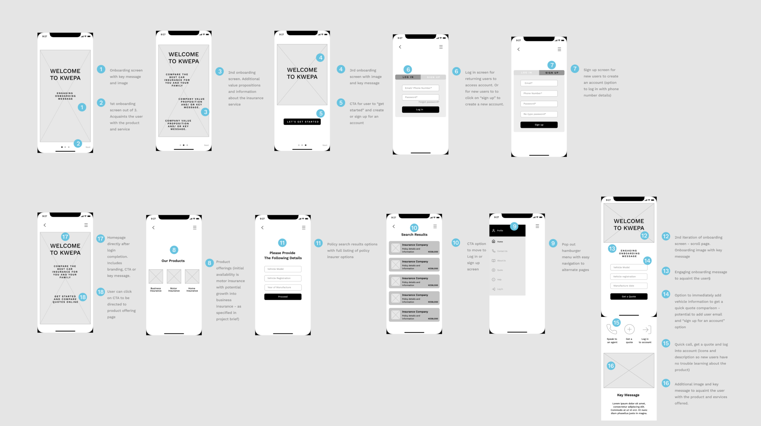
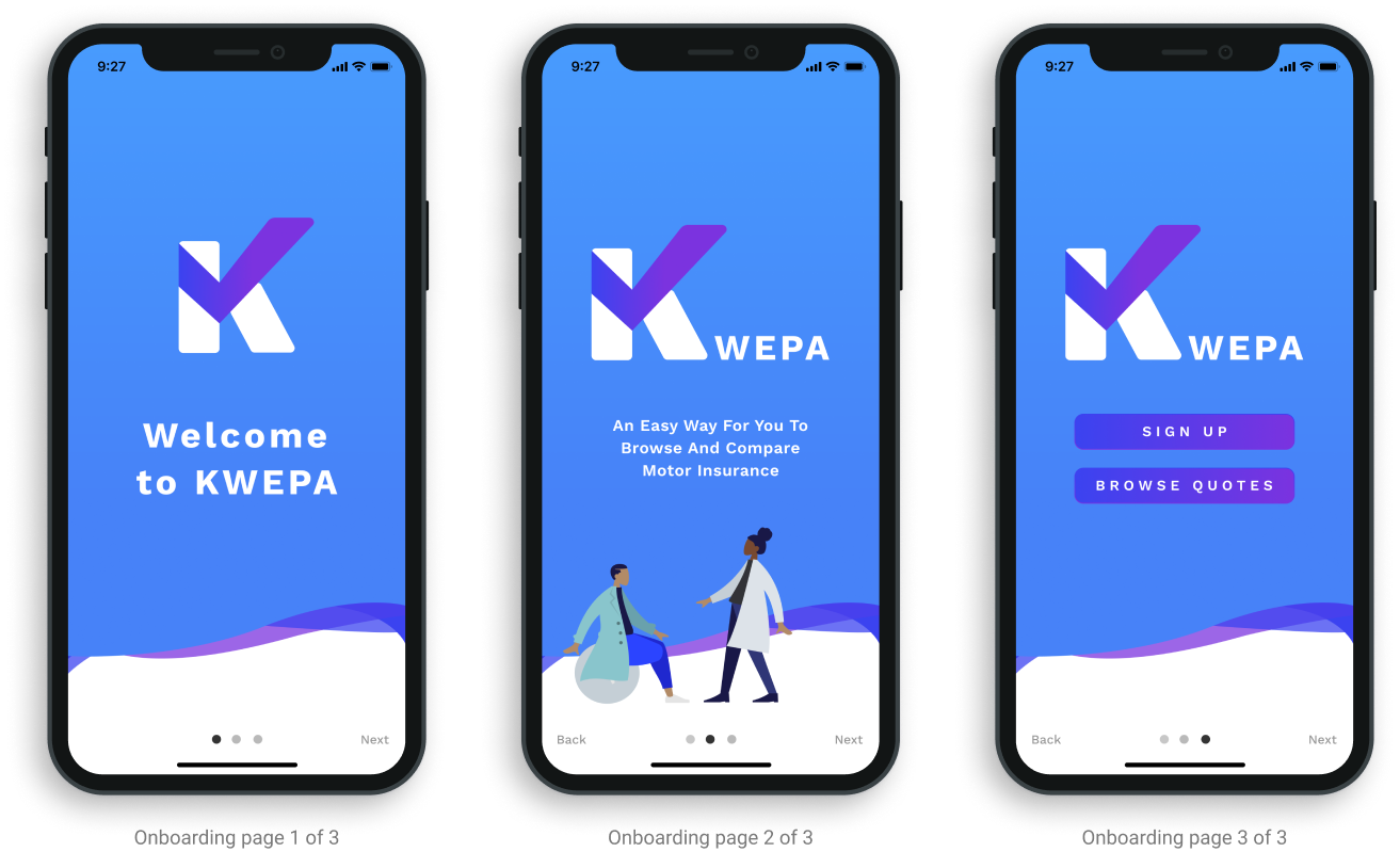
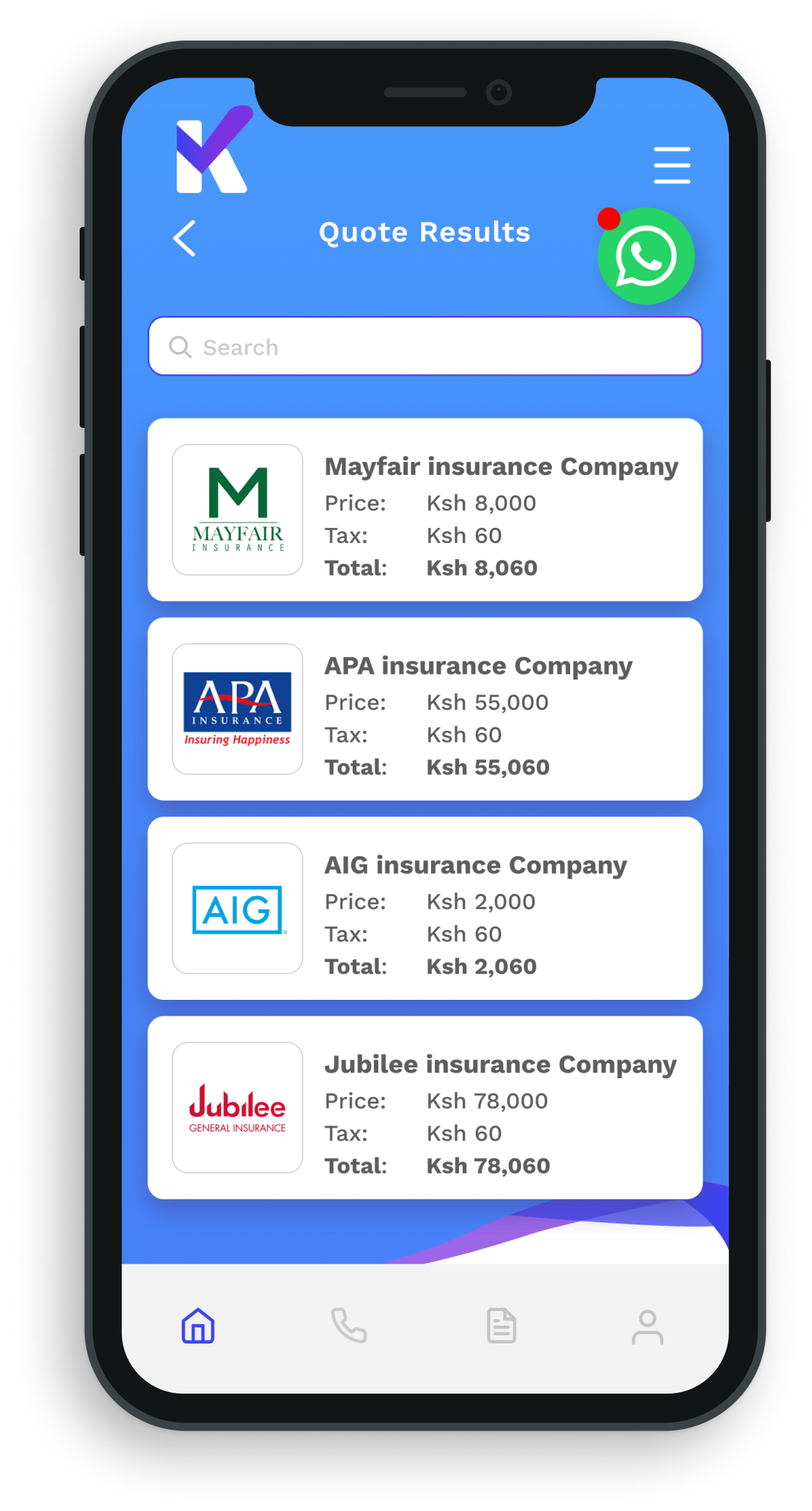
4. Prototype
Using the UI kit I developed from the style tile and logo, I moved on to creating a clickable prototype of the app on Figma. This prototype was helpful for the development team to flush out spec criteria and was also used during usability testing to gather feedback for further iterations.
5. Test and Iterate
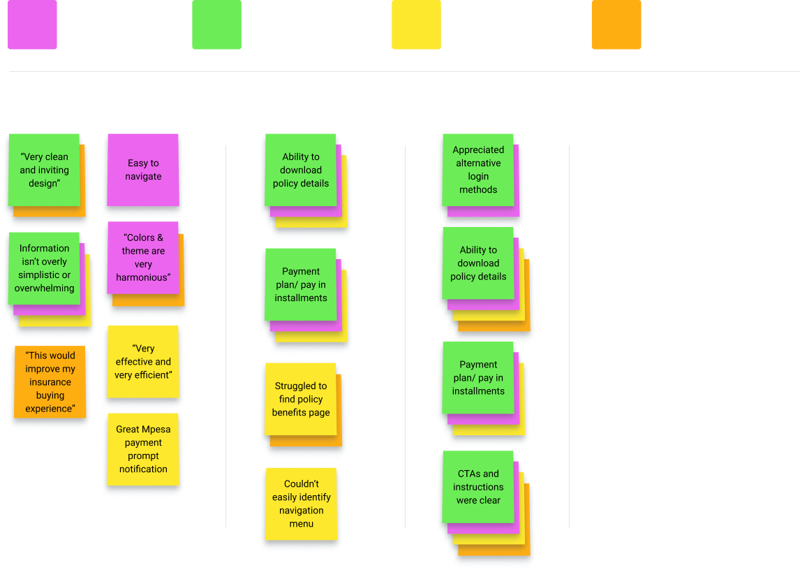
Affinity Map
Usability Testing (UT)
Goals:
I tested the mobile prototype against 4 participants who were familiar with the insurance landscape in Kenya. The goals were to test the navigability efficiency of the app to achieve specific user tasks, to understand user behavior patterns and pain points, and to gain overall feedback on user interface and user experience. The results of the UT were synthesized and organized in an affinity map (left) where I then prioritized high-level changes for iteration.
Objectives:
Can the user easily navigate the app?
Can the user browse motor insurance quotes easily?
Does the user understand more about the insurance buying process?
Can the user create an account and enter all their details successfully?
Conclusion
Based on the feedback gathered during UT, I addressed the following problems. I discussed adding a navigation bar on all screens so that the user would be able to quickly access different information at any point. User’s also expressed interest in a sticky chatbot or contact icon to further establish support and communication in case of concerns. The development team has been working on this solution.
Next Steps
Finish priority revisions and finalize the design.
Complete another round of Usability Testing to validate final design decisions.
Hand the project off to Icon’s team of developers if UT is successful and further iterations are not required.
Once the product is shipped, additional UT should take place to generate useful feedback in real-time.